Pure Fundraising
Nice, simple, uncluttered. With interesting menu design that is fully responsive.
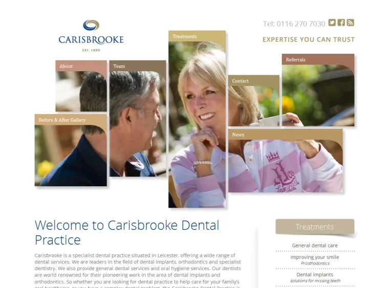
Lee, Visual Function_, asked me to build this site for a local fundraising company who wanted more engagement with their visitors. His designs were clean with a lot of white space emphasizing the ‘Pure’ brand. Most of the challenges I faced during construction included building the slightly unorthodox responsive menu system and getting the animated banner on the home page to act correctly in both desktop and mobile mode.
First I built static responsive HTML/CSS templates from the PSDs so Lee and the client could check that the site looked as good on screen as it did in the designs. I then added the menu with its animated sub menus, as well as making sure it snapped into the variable width mobile-version when viewed on a smaller screen.
The final template challenge involved getting the home page slider animations just right. Slightly complicated by having different designs for mobile and desktop, I think the final results work really well.
Then the next step was turning these static templates into a WordPress theme allowing the client to edit all aspects of the site themselves. I created a number of extra content types, such as ‘vacancies’ and ‘news’ to make the content management simpler for the user and to allow WordPress to pick up the relevant page template files. Overall the theme folder comes in at a tiny size.
Finally we installed the site online behind a protective wall and added some content. Then we walked the client through content addition which was so intuitive, using the WordPress admin area, that it didn’t take long for them to be fully self-sufficient. Lee definitely has a satisfied client.
Are you a design agency looking for a reliable front-end developer? I specialize in building fast, flexible, and pixel-perfect WordPress sites. Let’s team up to bring your designs to life!